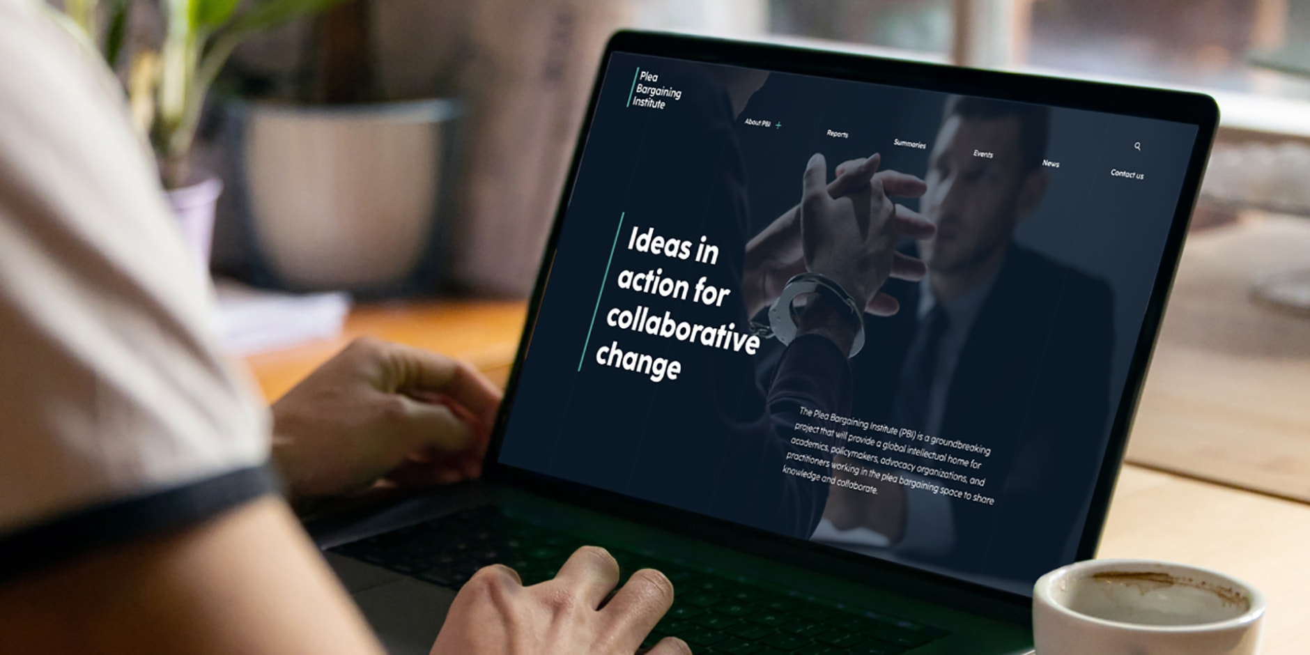
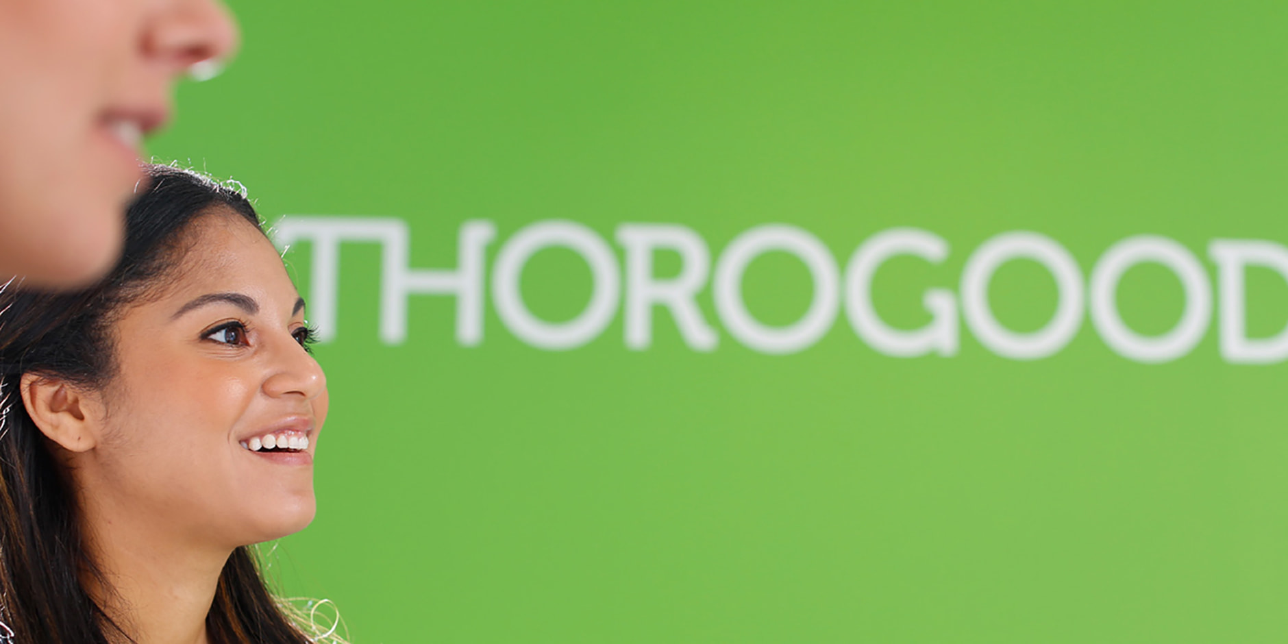
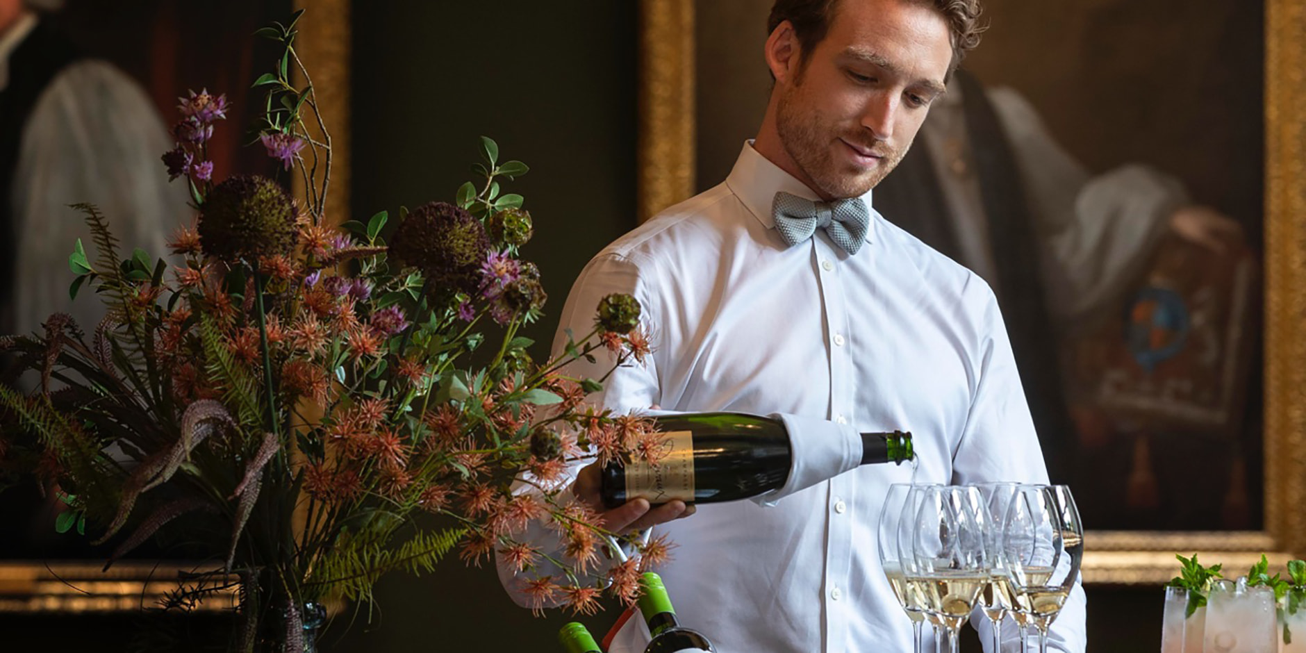
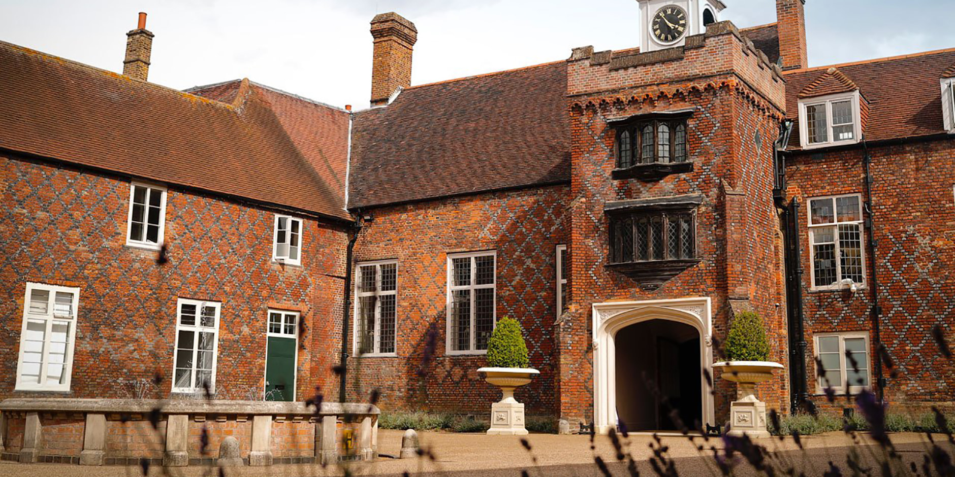
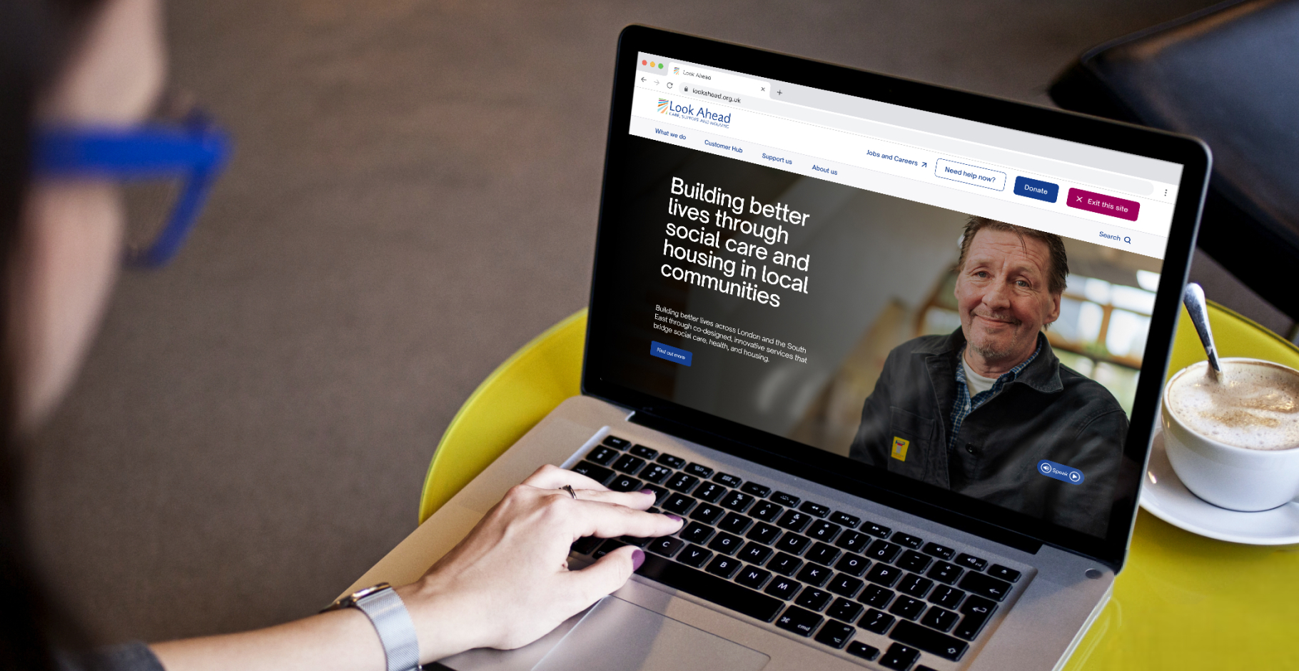
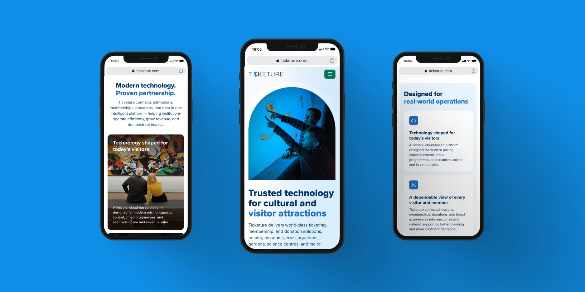
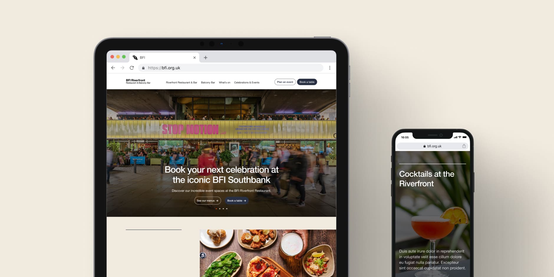
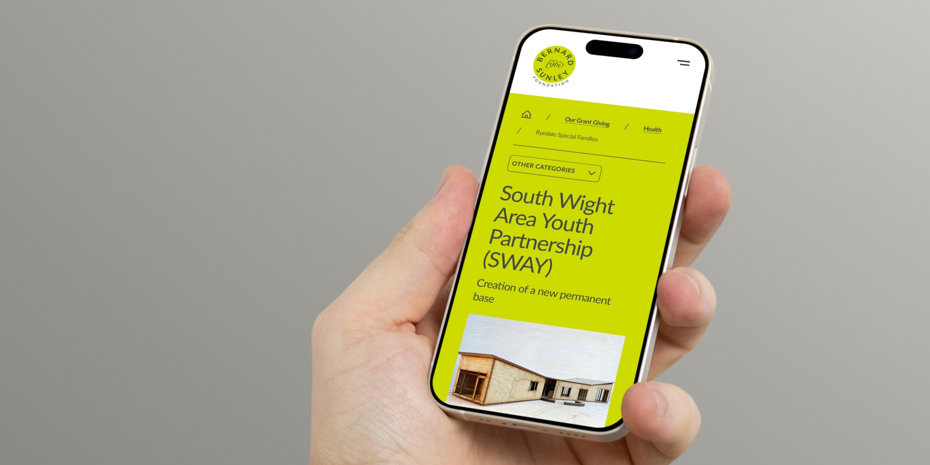
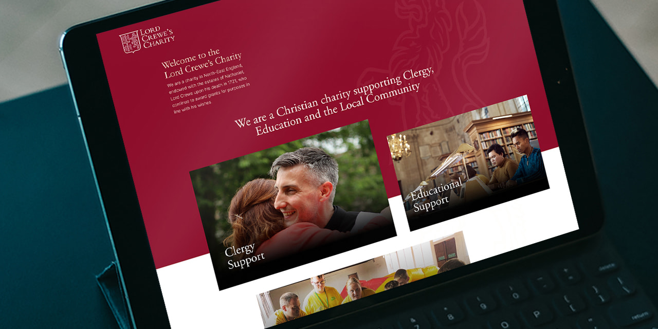
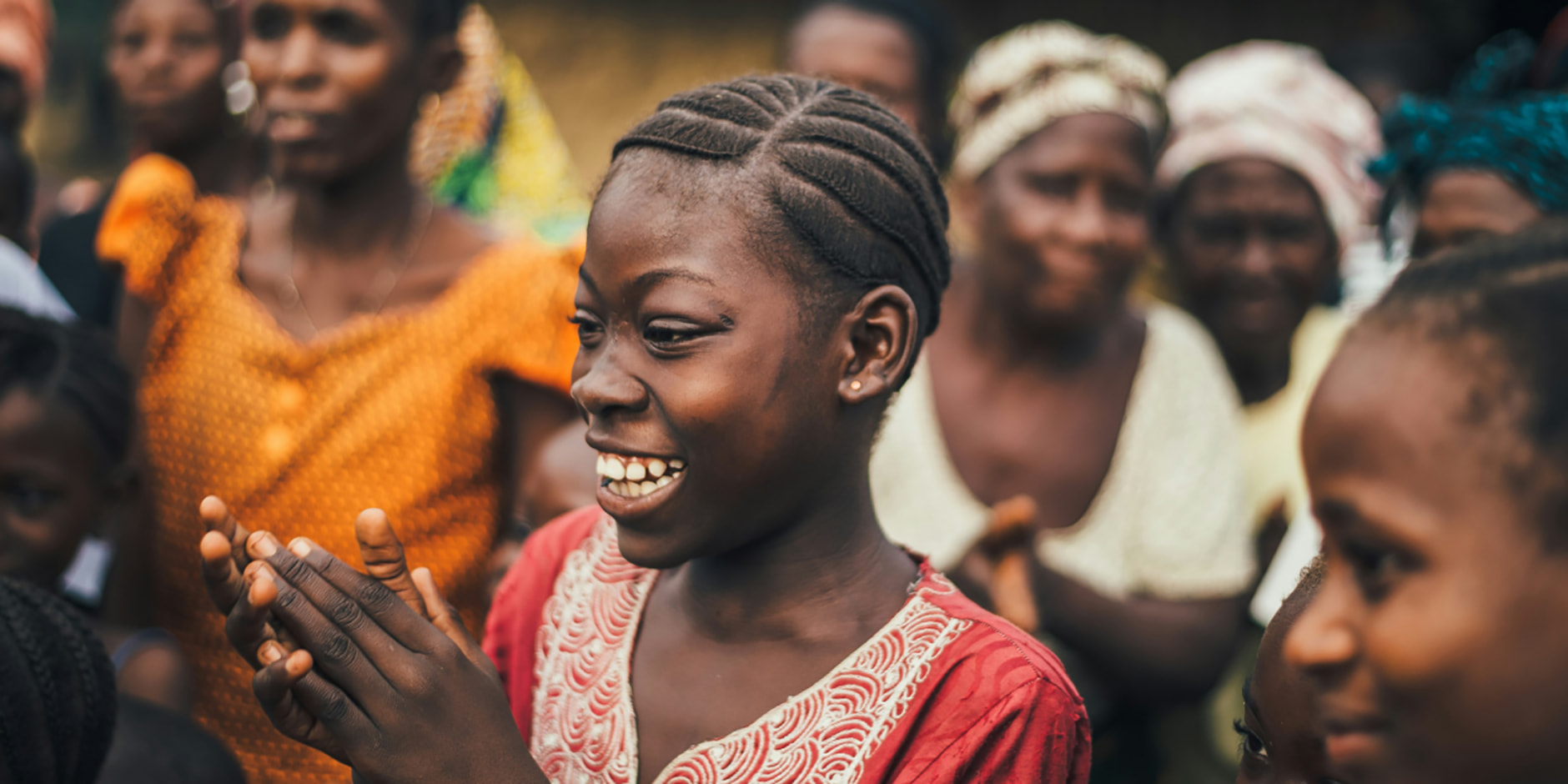
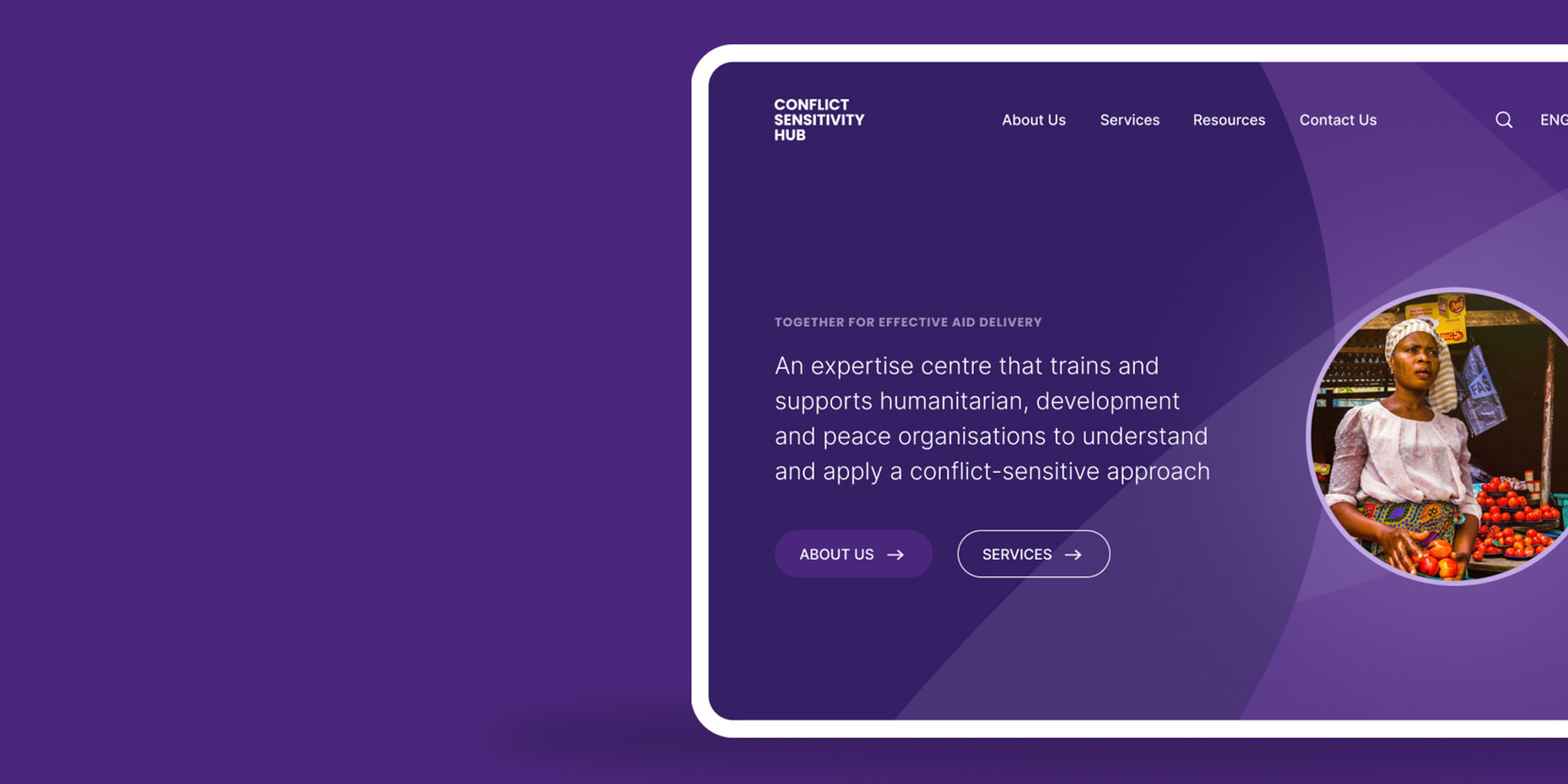
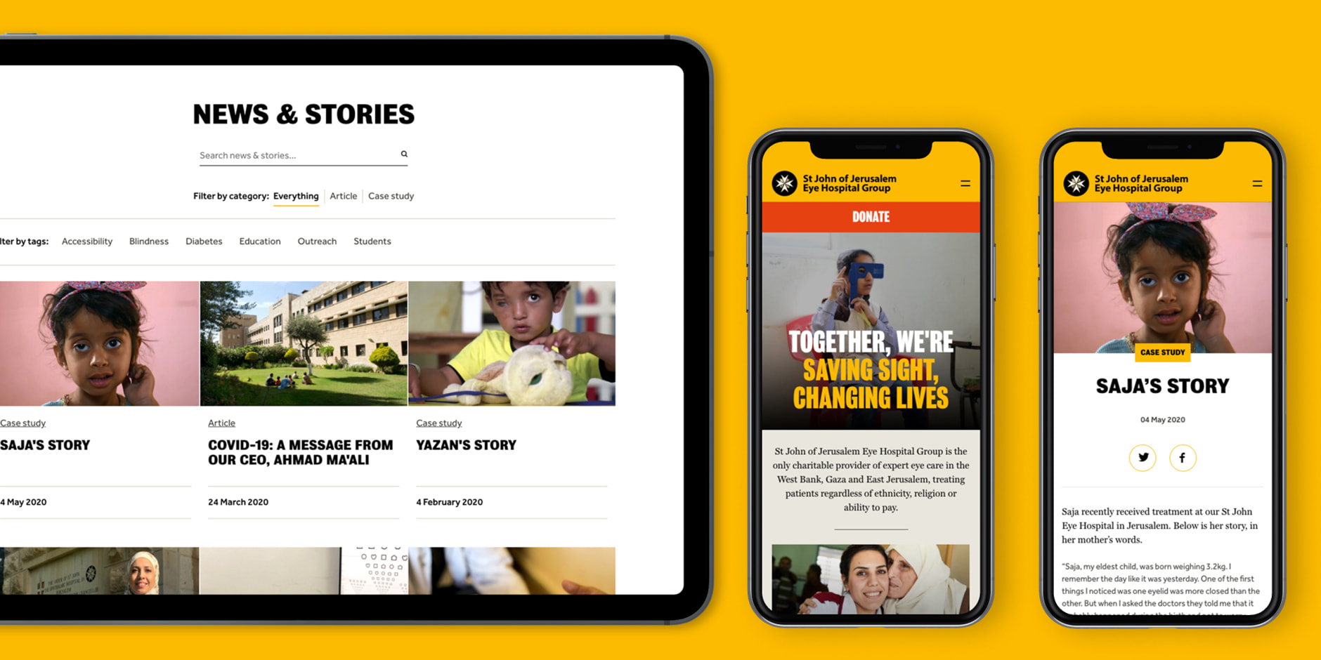
Vivo


Creating a brand that is both aspirational and desirable for students and also serious and grown up enough to engage teachers and parents.
Everlution, the parent company of Vivo, only had the name of the scheme and turned to Design Culture for guidance in creating the brand identity.
The brand’s appeal had to be wide-ranging and relevant across public, private and third sectors and resonate with a wide-range of age groups.
With three Vivo brands currently up and running, and plans for further applications, we needed to provide a solution that could grow with the company’s aspirations. With units accrued in the scheme known coloquially as ‘V’s the master vivo logo uses a crosshatch to position the V as a currency symbol. This core logo provides the basis for each sub brand. We then developed an over-arching, distinctive visual style for iconography to work with the core logo and individual sub brand name in each case. The palette is fresh and modern, and again provides scope to be added to as new schemes are added to the Vivo family.
The vivo.miles scheme has already had significant results in improving attendance and academic achievement in schools as well as reducing exclusions. The aim is to have 1,000 schools signed up by summer 2011. Vivo will be launching the vivo.cash Visa card later this year.