
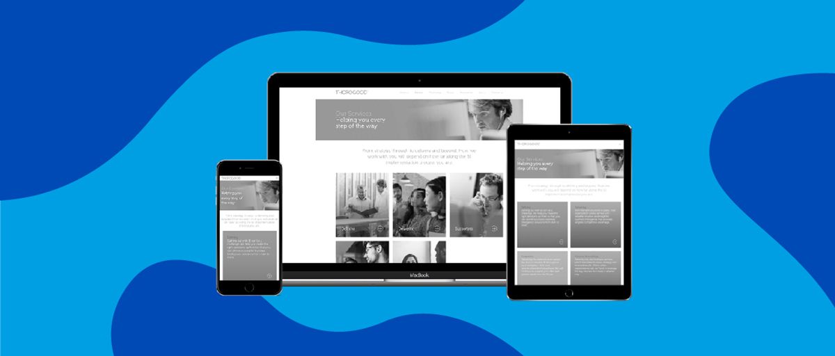
Love them or loathe them, smart phones are now an integral part of life. ‘Selfies’, bizarre Twitter rants and mobile Internet browsing have become the norm; it is becoming increasingly important for organisations to recognise this trend. A responsive website is one designed to ensure optimal user experience and compatibility across all devices – particularly mobiles and tablets.
Mobile compatibility is not a new concept; at Design Culture we’ve been creating responsive websites for many years, yet we’ve found that some organisations have still been slow at adopting this for their web presence. That’s why we’ve decided to look again at just how essential mobile compatibility has become, and the importance of being responsive.
The rise of mobile
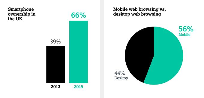
The proportion of UK adults with a smartphone is now 66%, up from 39% in 2012 (Figures from Ofcom). It is difficult to know whether these new adopters are lured in by 24-hour access to email, mobile Internet browsing or perhaps even Angry Birds. But regardless of motivation, this significant increase has contributed to a closing of the gap between desktop and mobile browsing. A fact highlighted by a 2015 comScore report, which found that 56% of UK digital media browsing time was spent using a mobile device, compared to 44% on a desktop. Another comScore report found that multi-platform access levels in the UK are now at 73%, exposing the diversity of browsing methods that are being used.
The way in which smartphones are being used is changing; they are increasingly used to perform tasks that previously required a computer. As a result, and in a transition that will most likely shock older generations to the core: voice calls and SMSs are no longer the primary function of a mobile.
The big players of the online world are already responding to these trends. Google’s ‘Mobilegeddon’ promised to shake up search results by penalising non-responsive sites through their new mobile-focussed algorithm. While this event hasn’t quite caused the apocalyptic scenes predicted by some (drama queens), non-responsive websites are certainly appearing lower down in search results. Bing and Chinese search engine Baidu are also moving to introduce similar plans – clearly smartphones and tablets are the future for Internet browsing.
Why responsive?

Having a mobile responsive website has many benefits. Most importantly, it creates a better initial impression of your brand, allowing mobile users to fully appreciate and explore your site with ease. While simultaneously giving developers the ability to curate the content shown to a user, and the order in which it is presented to optimise the mobile browsing experience.
Similarly, a responsive site will increase the average time a user spends browsing your site, as well as reduce your bounce rate (when a user leaves the site immediately without interacting with the page). There is nothing more frustrating than trying to view a non responsive website on a mobile device. If your website is causing this frustration, it will damage your brand reputation in the mind of the person browsing. Instead, user experience on a mobile or tablet device should make full use of what technology offers. Two simple examples of this are: the ability to swipe through pages of content rather than clicking, and practical features such as being able to touch a phone number or email address to make a call or send an email, both of which mean closer integration with the mobile or tablet technology in use.
It is also important to remember that mobile browsers have different requirements. Speed is of the essence, and a compatible site will decrease the load time of pages ensuring a better user experience. Older template based sites often have code that is not relevant to mobile, which will eat into bandwidth and slow your users down.
Although the importance of a responsive website is proven, at Design Culture we are still surprised at the amount of organisations that have not made the transition. These organisations need to act quickly to create a compatible website to improve their audience’s mobile experience, avoid the pitfalls of not being responsive, and in many cases place themselves ahead of their direct competition (regardless of which sector they operate in).
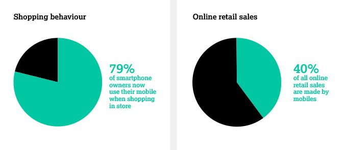
Mobile browsing has also had a significant impact on shopping behaviour. It’s now estimated that 79% of smartphone owners use their mobile when shopping in store: comparing prices, viewing product reviews, scanning barcodes and searching for special offers are all common. Ensuring that your business is in front of these users at this moment is essential. Furthermore, mobile purchases now account for over 50% of all online retail sales. As a retailer, having a mobile responsive website ultimately promotes user-confidence and leads to increased mobile purchases.
Having a single responsive site that caters for all devices brings clear technical benefits, both in terms of maintaining your website and search engine optimisation (SEO). Responsive web design allows you to share content from a single URL, preventing a dilution of your Google search ranking across two or more sites. Google can easily index a single URL for higher search engine results and you will avoid being penalised for being non-responsive. Mobile compatibility also means you can manage and update web content in a single location, lowering the effort and cost of site maintenance.
Going mobile

As you can see, having a responsive site is a crucial aspect of website development. At Design Culture we have long taken mobile compatibility into consideration on our digital projects. We approach site design in a ‘mobile up’ fashion and we’re firm believers that compatibility is an essential, and logical commercial investment for all organisations. One you’re guaranteed a return on. Having a mobile responsive website allows your audience to fully appreciate the considered design of a webpage and ensures that your site will be seen in ‘all it’s glory’, regardless of the device it is viewed on.
The future of responsive websites
It is difficult to predict the future. Will Apple take over the world? Will Donald Trump be the next president of America? Will England lose to Australia and Wales, crashing out in the group stages at their own Rugby World Cup? Clearly predicting what’s next for responsive design is also difficult – yet two trends are becoming increasingly clear. The first is that there will be more variation than before in screen sizes, with the arrival of the Apple Watch and Google Glass suggesting a sign of things to come. Secondly, voice activation is likely to play a larger role in browsing, meaning that audio responsive websites may be the next big thing.
Regardless of what the future holds, the most important consideration for the time being is that your website should cater for all users and all devices. The first step to achieve this is to be responsive.
Gemma Charles Head of Brand Picker InstituteWe chose to work with Design Culture to redevelop our website. Early on in the process we realised just how important having a responsive website is; we really recognised the value of the ‘mobile first’ approach Design Culture took to the design. Since we launched the site we have seen fantastic results, with a 30% increase in unique visitors - a large proportion of this success can be put down to the site now being fully responsive.
