Technologies and integrations
- WordPress
- Mailchimp
- Cloudinary
- Gravity Forms
Transparency International US
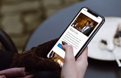
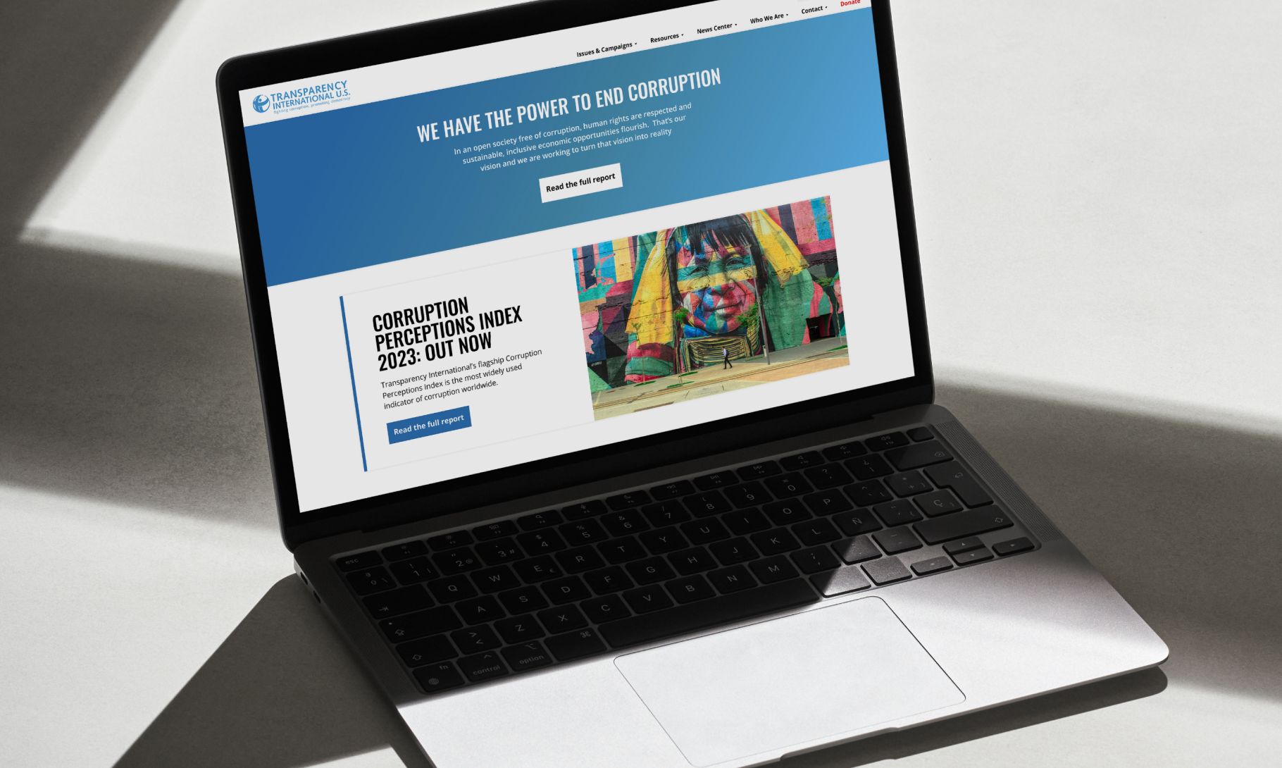
Strengthening the digital presence of the US chapter of global anti-corruption coalition Transparency International, through delivering a technical upgrade and strategic design refresh to its WordPress website.
The US chapter of the organisation is relatively young and small, with a growing team focused on policy development and legislative advocacy. It’s work happens primarily “inside the room” – connecting unlikely allies, influencing congressional staff, and shaping laws and policy. The website needed to move away from any perception of grassroots activism and instead position Transparency International US clearly as a trusted, strategic policy resource.
A comprehensive technical upgrade
We began with backend improvements to streamline content management and improve internal efficiency. As well as moving the site to an enhanced development environment, and implementing Cloudinary for image optimisation, we made upgrades to the CMS to improve usability. With a small team, it was important that the CMS worked harder for Transparency International US, reducing friction and making publishing simpler and more efficient.


Strengthening positioning through a UI/UX update
We redesigned and restructured the homepage with a focus on ensuring the organisation’s positioning is clear for any first-time visitors, communicating who Transparency International US is, what they do, who they do it for, and importantly, why it matters.
We used the hero area to introduce a clear positioning statement, supported by strong typography and a considered visual treatment. We created deliberate onward journeys to the Who We Are page, where updated content communicates the organisation’s value and impact more clearly, and through to the Issues & Campaigns section to support deeper exploration.
This approach ensured that new users are guided intentionally, while existing audiences – such as congressional staff, journalists and advocacy partners – can continue to access specific resources directly.


Brand & Visual Uplift
Alongside structural changes, we implemented global typography and navigation refinements. We brought font styling more closely in line with the international Transparency site, adjusting spacing and hierarchy to improve legibility and consistency.
We refreshed the global navigation for a lighter, fresher feel and rationalised the size of dropdown menus to improve usability.
Collectively, these changes have delivered a cleaner, more contemporary visual language – and now aligns more closely with the global brand, while still retaining a distinct visual difference.


The result is a strategically repositioned and technically improved website that more accurately reflects the organisation’s current role: a policy-focused, insider advocacy body influencing anti-corruption legislation.
The refreshed homepage clearly communicates who they are and who they serve, while improved typography, navigation and modular components has delivered a visual uplift — fresher, cleaner and more confident.
Most importantly, the site better supports and delivers to their core audiences — congressional staff, journalists and advocacy partners — with clarity, authority and ease.


Want to strengthen your digital presence and drive engagement?
Send a message or call us 020 7375 6360.
"*" indicates required fields