NHS Alliance
Design Culture has partnered the NHS Alliance (formerly the NHS Confederation) on a number of strategic brand deliveries, helping to bring its products, services and programmes to life with clarity, purpose and visual confidence.
Two recent projects – The Evolve Collaborative and branding of communications agency HealthCommsPlus – show how considered branding can turn ambitious propositions into credible, market-ready identities.


HealthCommsPlus – a confident brand for a new agency with a powerful proposition
In 2025, the NHS Confederation launched HealthComms+, a specialist communications agency offering its members and wider public sector organisations a credible, cost-effective alternative to private health communications consultancies – and one that reinvests its profits back into the sector.
A fast-paced, collaborative process
We ran a structured process that moved quickly from definition to creation. Brand architecture work established how HealthComms+ would align with the NHS Confederation masterbrand. Two naming workshops were at the heart of an agile process, moving from language banks and naming territories to the final name. Values and personality were defined early: credible, creative, collaborative, purpose-driven and forward-thinking, and brand language developed to be used front and centre within the visual identity.

Visual identity
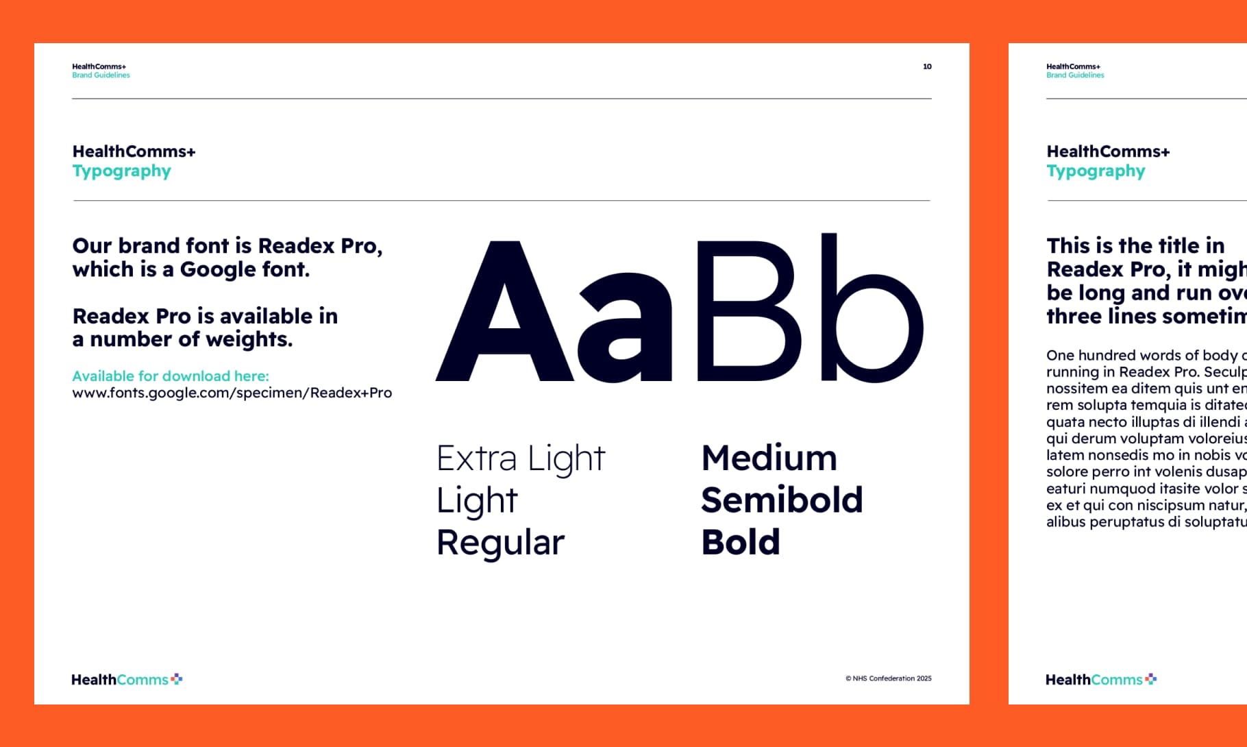
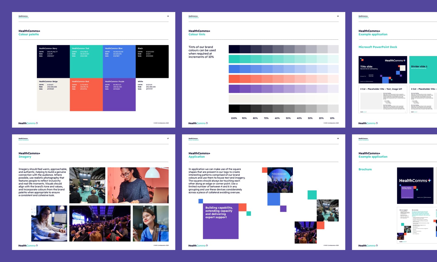
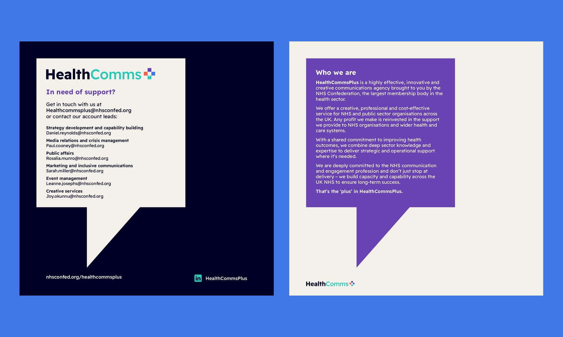
The logo centres on a speech bubble device – a simple, direct symbol of communication and dialogue, and a powerful signifier of the added value of HealthCommsPlus reinvesting any profit it makes back into the sector. Being of the sector, and for the sector. Readex Pro was chosen for its clarity and strong accessibility credentials. The colour palette is anchored in NHS blue and teal, with warm, bright accent colours that bring energy without straying from the sector’s visual conventions. Geometric squares and authentic, people-focused imagery form the wider graphic language.
Launch-ready from day one
The brand launched at ConfedExpo 2025 with a full suite of essentials: website assets, LinkedIn graphics, a brochure, PowerPoint templates, email banners and event collateral.


The Evolve Collaborative – an analytics platform to empower NHS members
A complex proposition, made compelling
When the NHS Confederation partnered with healthcare analytics company Beamtree to launch The Evolve Collaborative, they needed a brand that would work hard to clearly communicate the offer. The initiative combines real-time analytics with a peer learning community – a distinctive, benefit-driven offer that required careful positioning to feel both credible and accessible to NHS members.
The brand also had to express partnership without confusion: NHS Confederation leading on the community, Beamtree bringing the data platform, and both sitting comfortably within a single identity.

The central creative idea was evolution itself – the progression and improvement of hospitals and leaders, guided by data and shared learning. This sense of progress and transformation shaped all design decisions.
The “+” in the name – and in the brand mark – captures the agency’s core promise: additional capacity, built capability, and every pound reinvested back into the NHS.


Identity and visual language
The logo was designed with a clear descriptor, to ensure the initiative could be immediately understood. For typography, we selected Figtree – a versatile, accessible Google font with enough weight variation to anchor a strong design system across digital channels.
The colour palette takes NHS-trusted dark blue as its foundation, then expands into brighter, warmer tones to signal intelligence, energy and collaboration. Rather than a single fixed scheme, the palette was built to work in multiple combinations, giving flexibility across different communications.
The visual language is built from geometric shapes – individual data points that overlap, layer and connect to form new patterns. It’s a quiet but effective metaphor: insights coming together, hospitals collaborating, data becoming meaningful action.
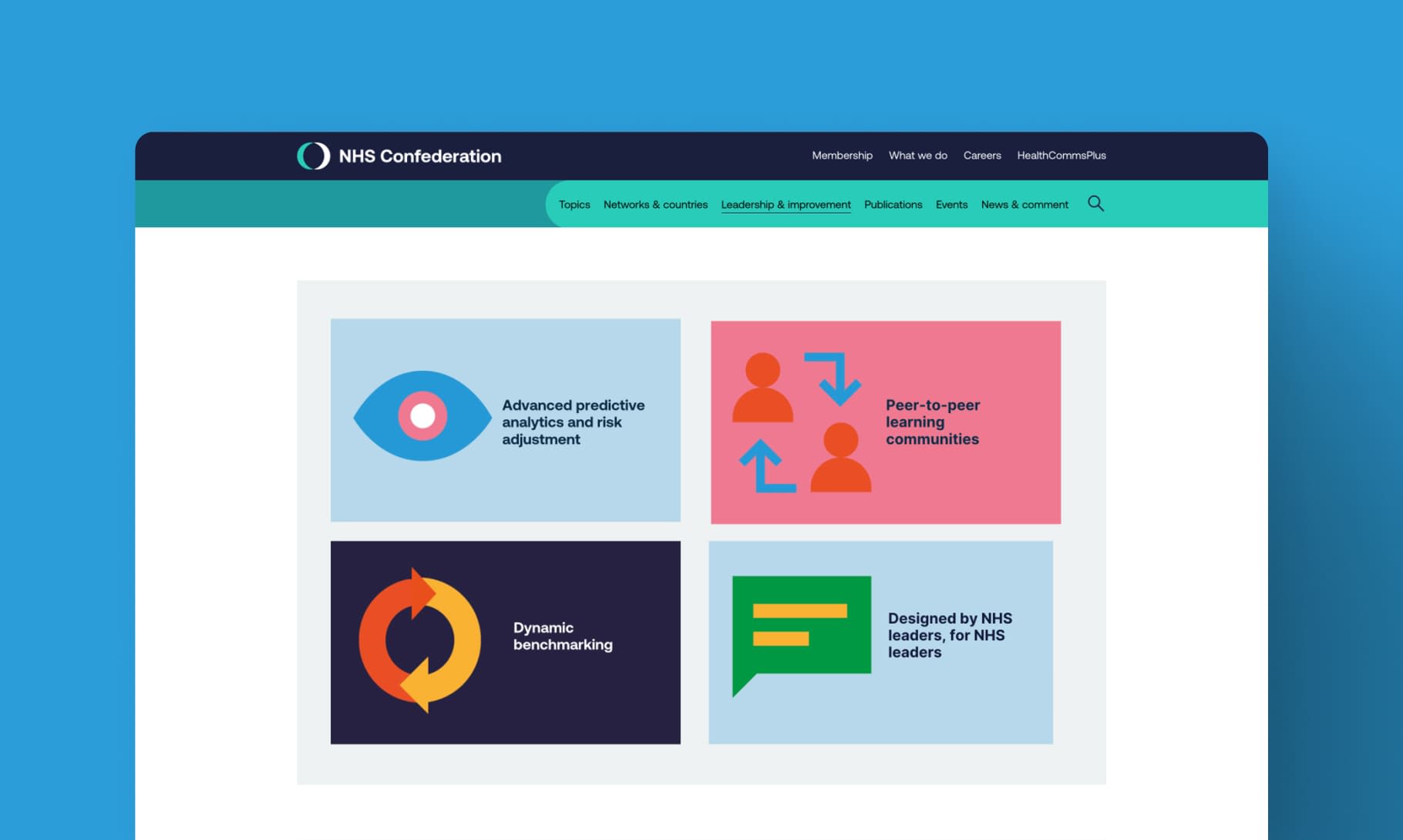
The brand was built out into a full suite of launch assets – web banners, social media cards, iconography and a marketing brochure – designed to function as one coherent system.