Technologies and integrations
- Branding
Institute of Development Studies
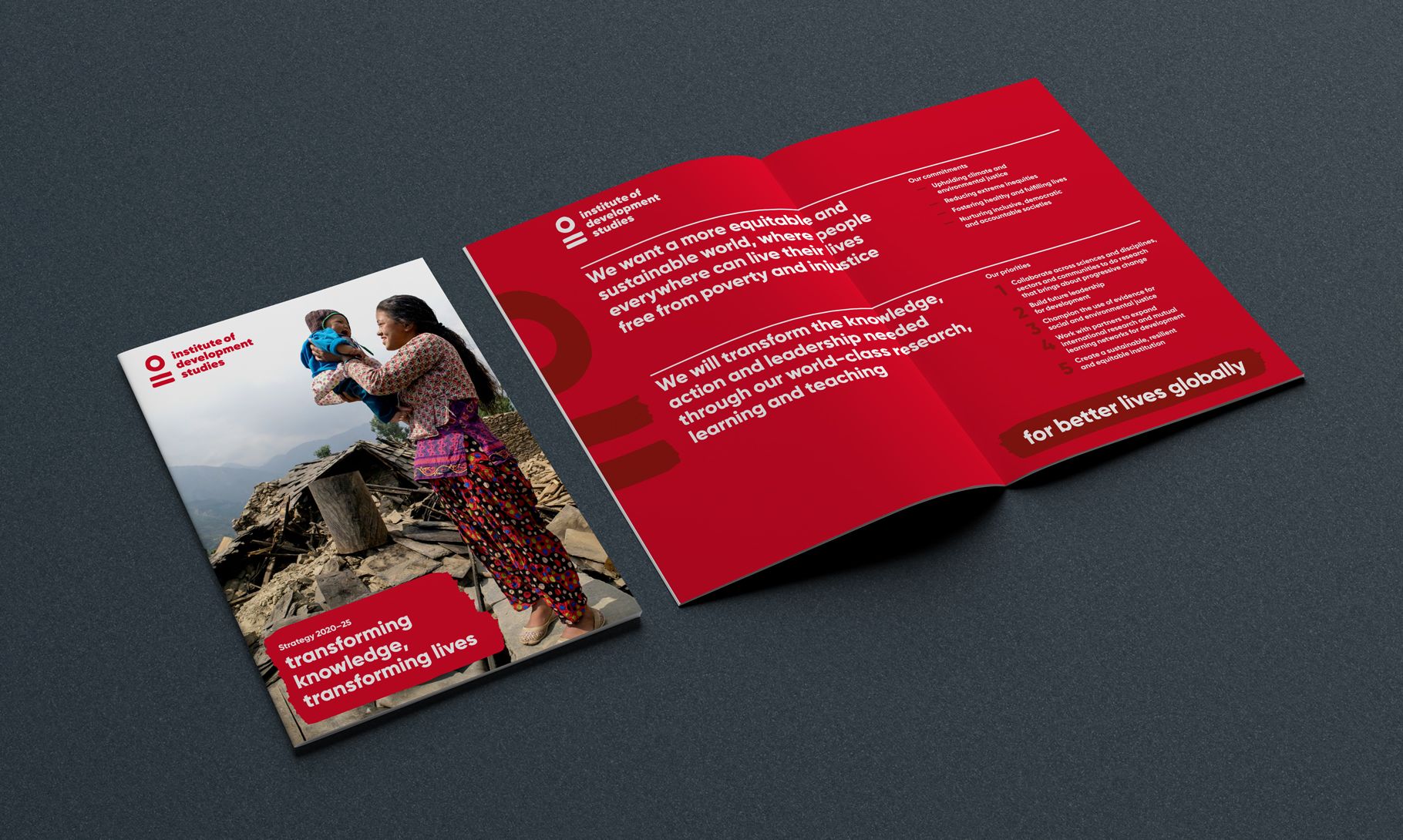
IDS is a global research and learning organisation for equitable and sustainable change with an ambitious vision for future. In what was a highly collaborative project, we worked to define a strengthened positioning for the brand that reflects the Institute’s strategic ambition and values, and captures its unique mix of research and learning.
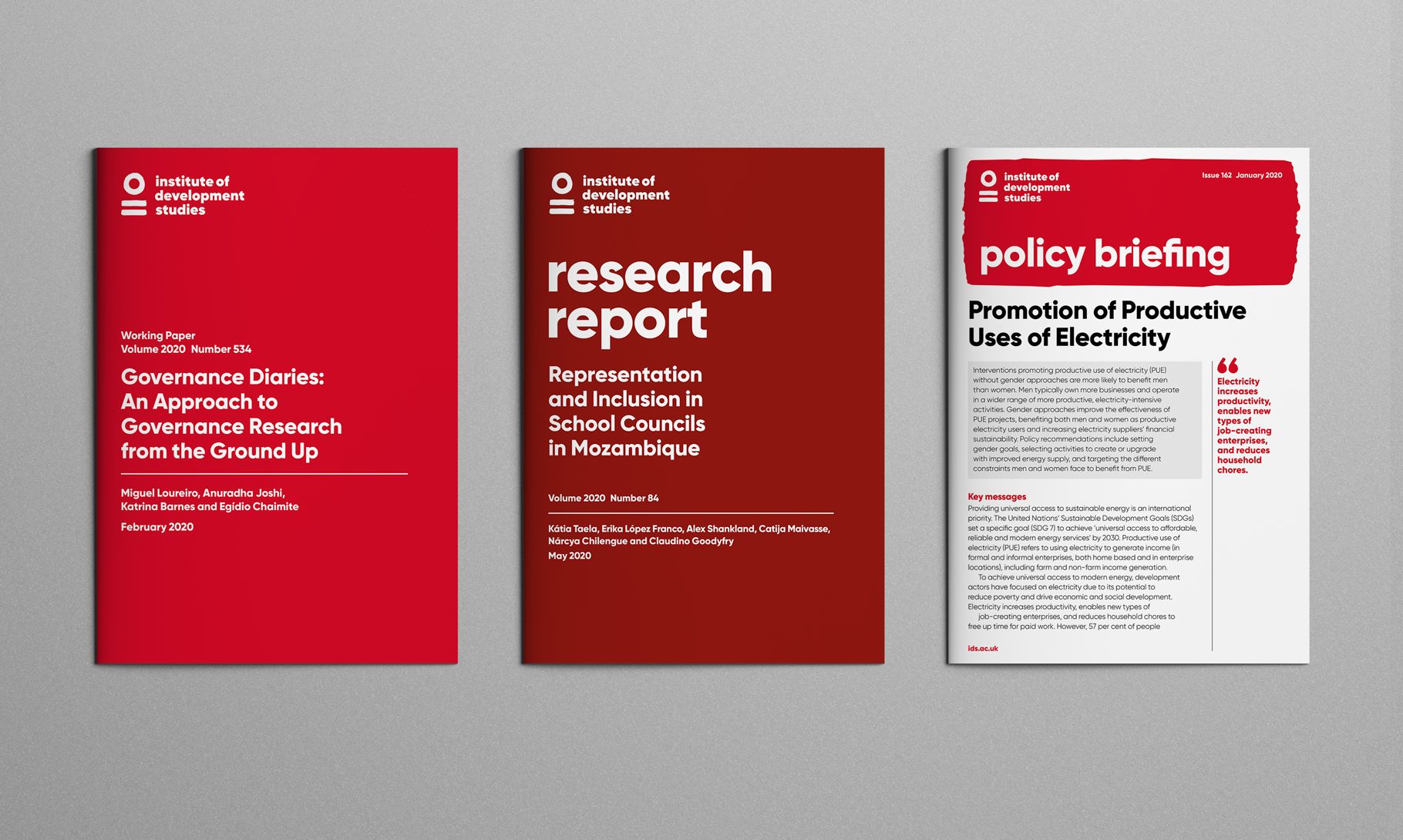
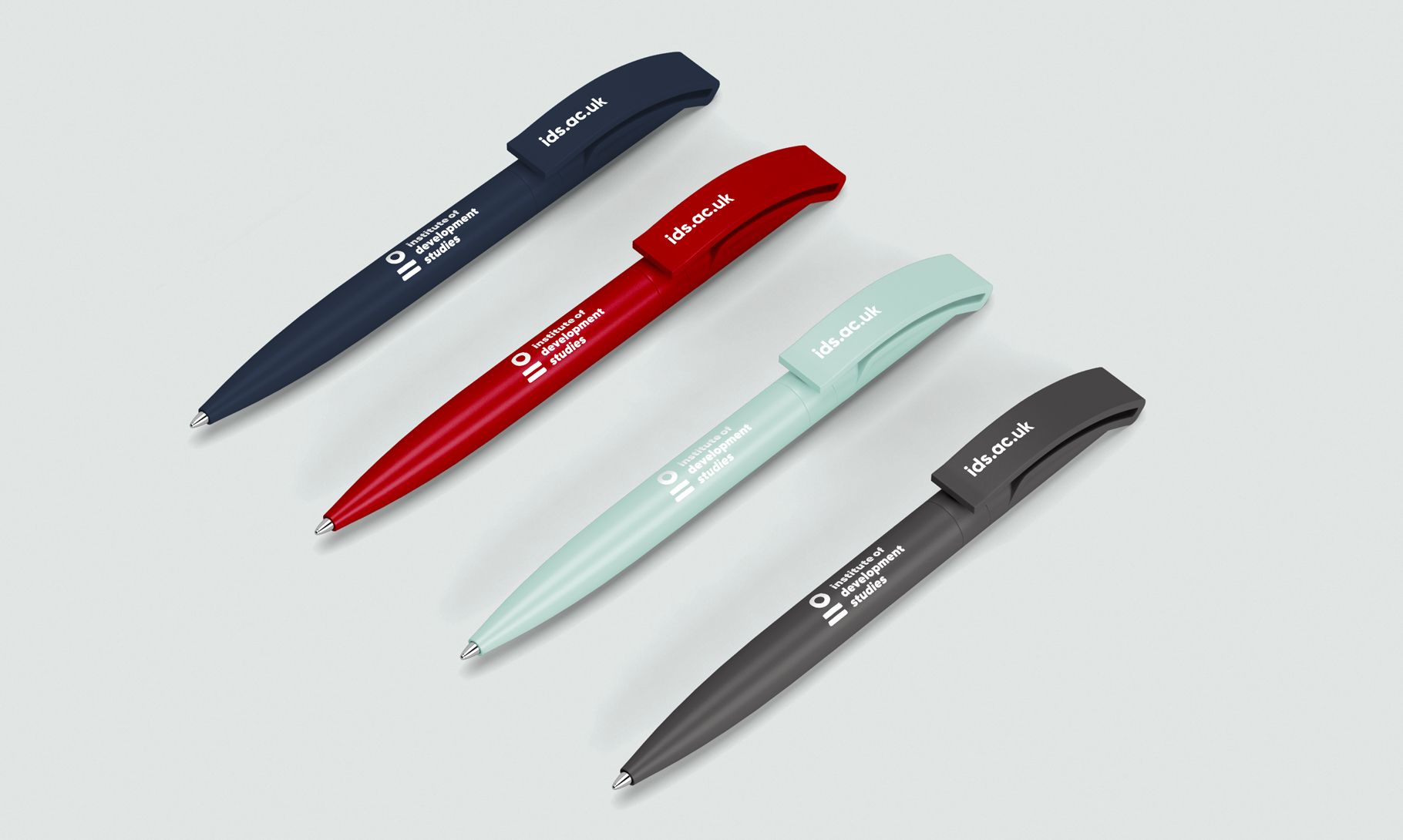
As a brand, IDS was struggling to communicate its offer to a wider audience. In a key shift, the move to using the fullest expression of the name in the logo promotes understanding and will build recognition. The brand leads strongly with a vibrant red, supported by a limited palette. It’s a colour that has equity for IDS within its existing audiences and differentiates the brand on a busy international stage.
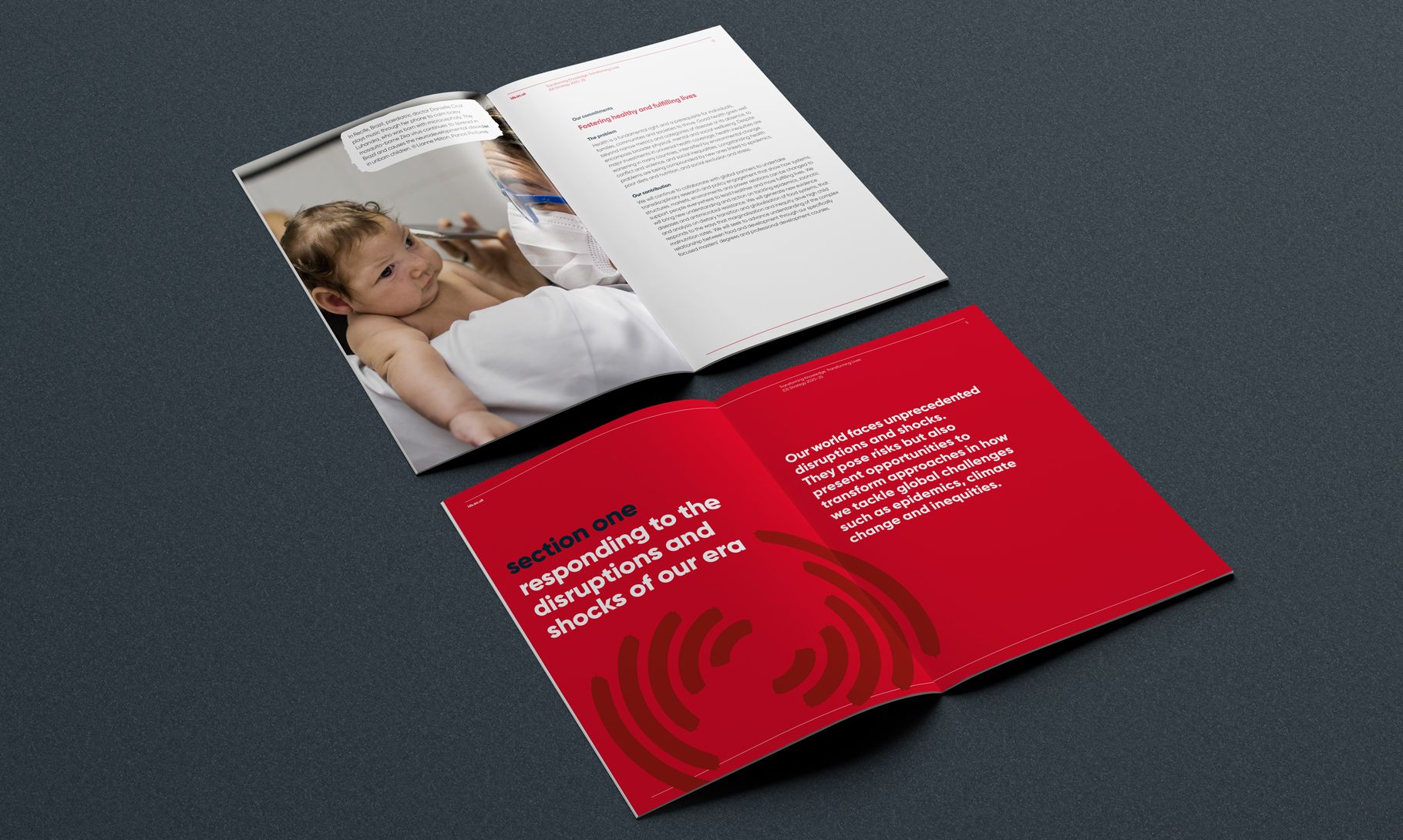
Overall, the new brand immediately presents as more open and outward-facing, positioning IDS as a modern, progressive and collaborative organisation – one with influence, credibility and authority.
IDS has a need to reflect its internationalism. The hand-drawn and immediate nature of the logo brings a human quality to the brand and there is a universal language in the simplicity of the symbols and how they are read together in the logo. And that mark-making extends to become a tool for IDS to use creatively across a range of application.
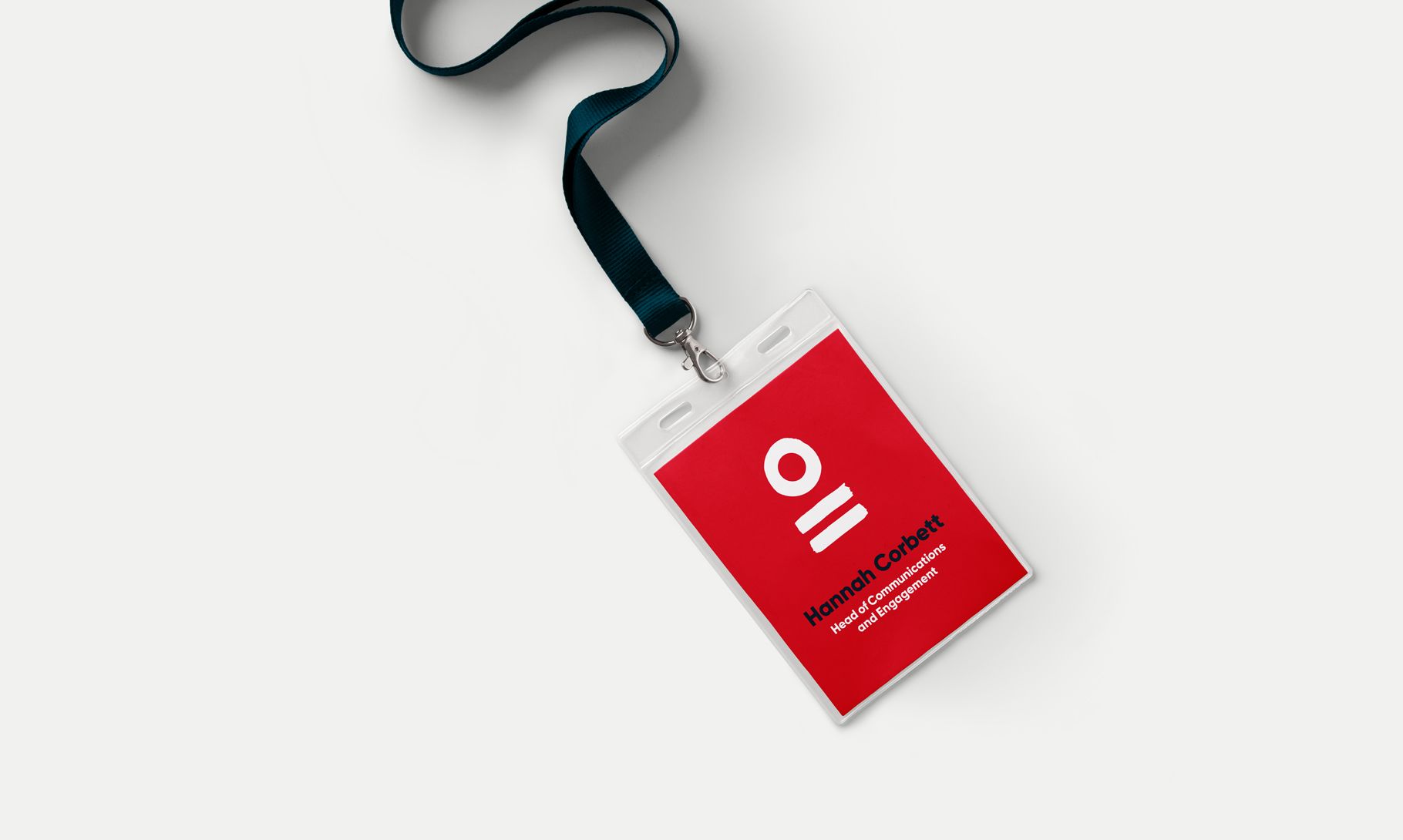
Hannah Corbett Head of Communications and Engagement Institute of Development StudiesEvolving our brand so it reflects our values and commitment to build a more equal and sustainable world has been a highly rewarding and productive process. Design Culture expertly guided and challenged us to clearly articulate and visualise who we are, what we do and why we do it, and ultimately helped us position ourselves so we can deliver on our ambitious commitments and priorities for the next five years.
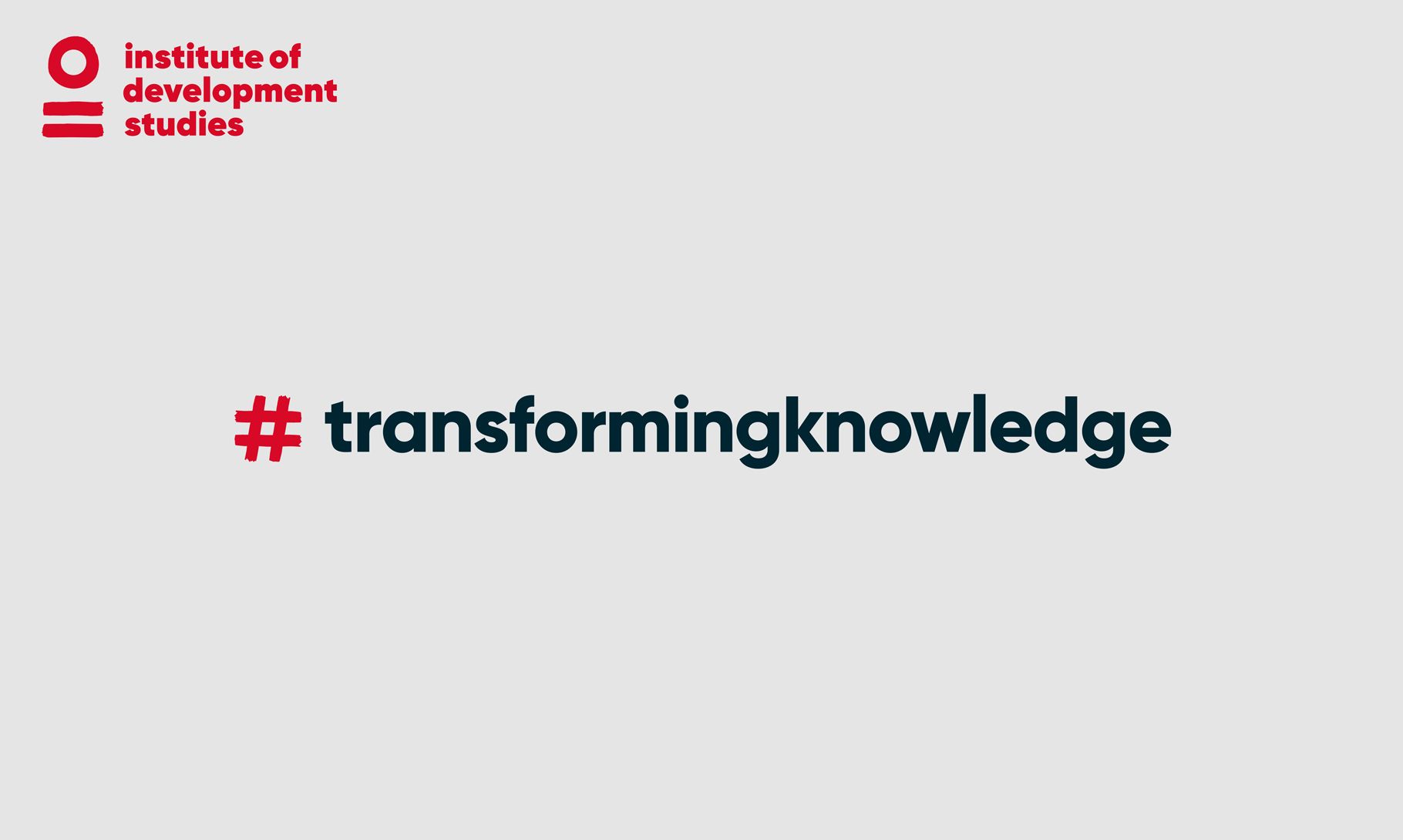
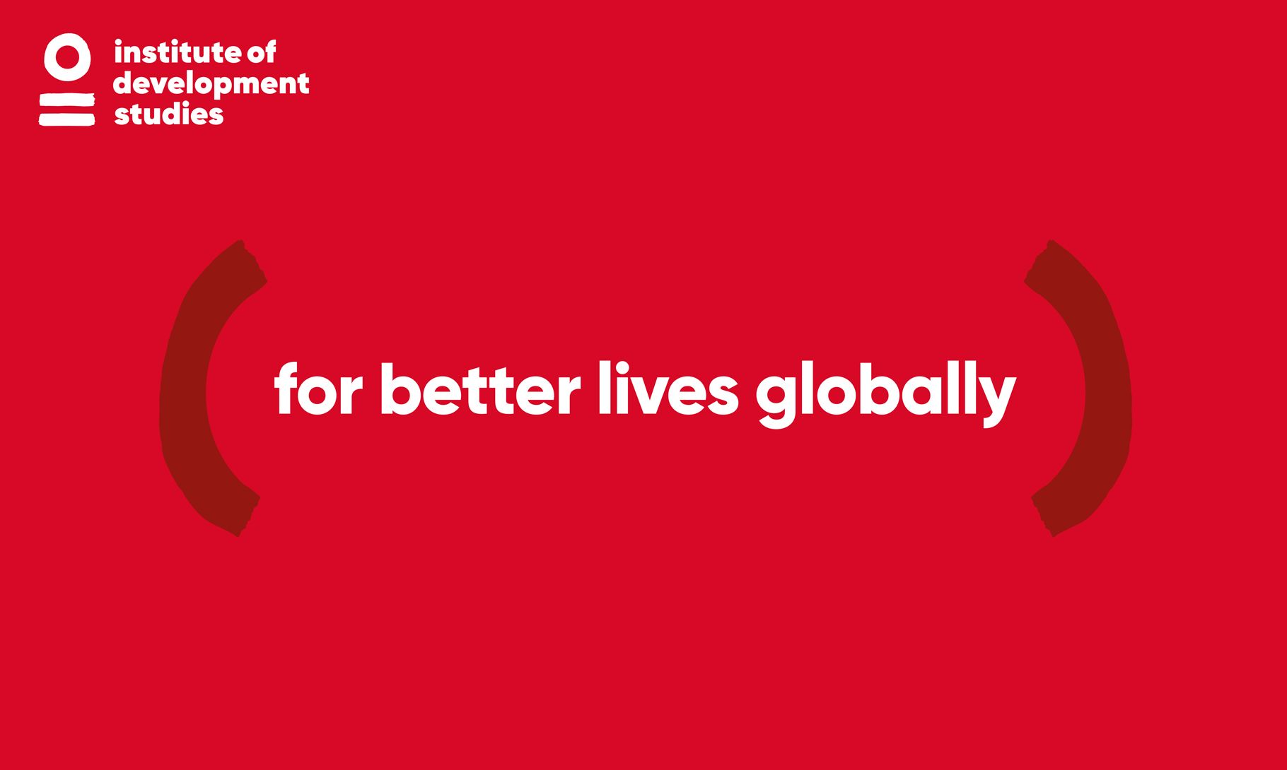
With the brand’s strength in its simplicity, at times powerful language is all that is required. ‘Transforming knowledge for better lives globally’ is language that sits at the core of the brand and expresses the brand idea succinctly.
Gilroy is a bold, modern sans-serif which gives the brand an authority even in the simplest application of just type and colour. It’s highly accessible in use and plays a central role in the brand, delivering against a key remit of the brand brief and aligning with IDS goal to ‘make our work accessible to all’.
The brand officially launches in June 2020, leading with the publication of the IDS Strategy 2020–25.