Technologies and integrations
- Branding
British Insurance Brokers’ Association
The British Insurance Brokers’ Association (BIBA) needed to redefine and strengthen its brand, to ensure relevance and meaning for its audiences today and in the future. We transformed the brand to better represent their members and champion their sector in an increasingly critical period for the industry, cementing their place at the heart of the brokering.

We immersed ourselves in the organisation, engaging stakeholders, carrying out a brand and architecture audit and competitor and sector analysis. Distilling all of that insight, we clarified the brand’s position –to raise awareness and educate the consumer on the benefits of using a broker and brokering, to the benefit of all. And, we built a brand strategy to support BIBA’s vision – to be known as the essential and most influential general insurance organisation representing brokers, intermediaries and their customers.
At the heart of the brand is our audience. And while the audience picture for BIBA is diverse, our primary audience and focus is and will always be our members.
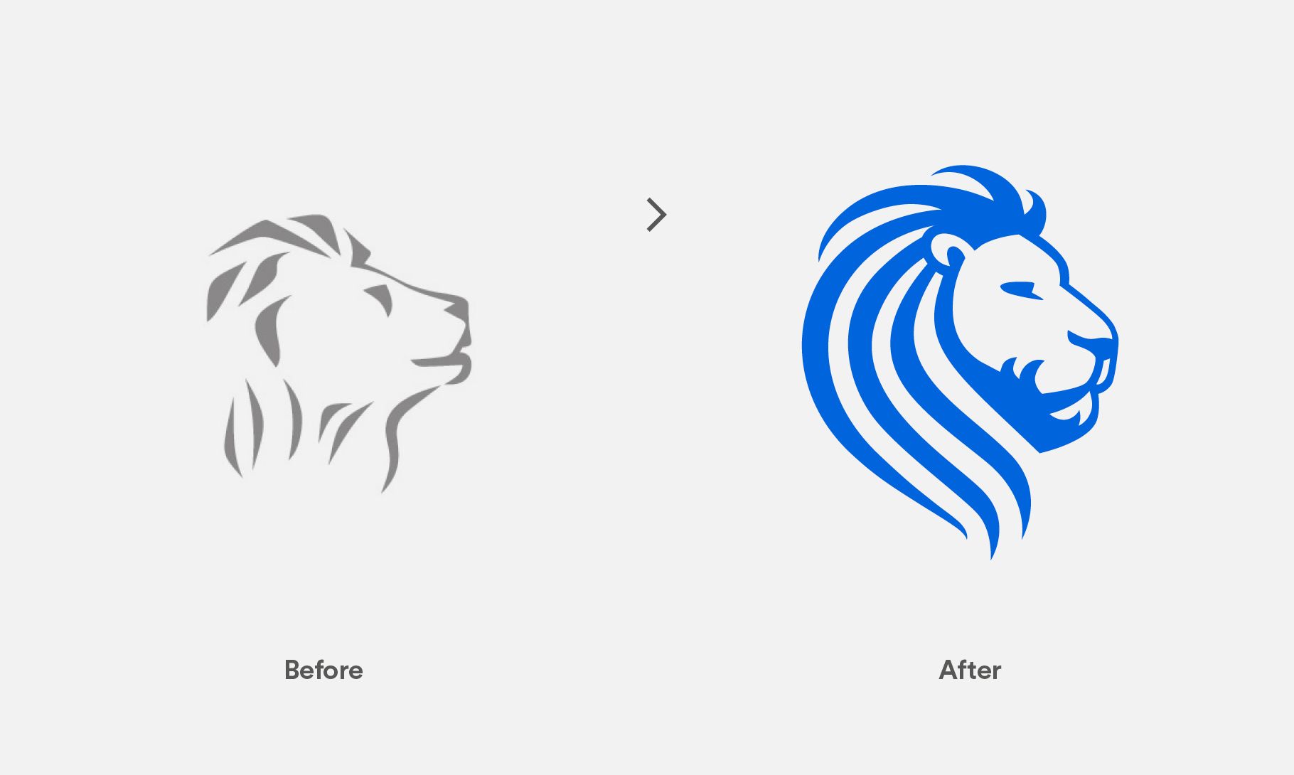
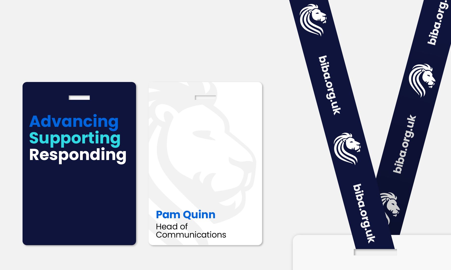
A key recommendation from the insight was to retain The Lion. A well known and trusted symbol of the organisation, synonymous with BIBA, The Lion held a lot of brand equity but needed to be re-invisioned, to strengthen it’s appearance, and bring a quality to reflect the clarified BIBA brand in the fullest sense.
The rigour and a craft in the new logo reflects BIBA’s trusted and expert nature, while still feeling accessible and approachable, and that continues throughout the brand.
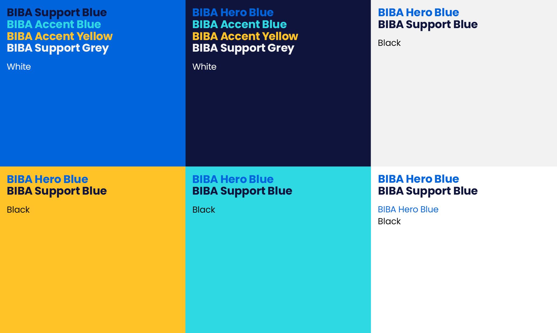
Our typeface is Poppins – highly legible and easy to access as an open source Google font but flexible enough in what it offers to create difference and distinction in how its used. Also synonymous with BIBA is the colour blue. So it remains the focus in the new brand but the ‘hero colour’ at the core of the brand is much more vibrant and bright, and better aligned with BIBA’s personality. Accent colours build out a palette and bring a modernity and ownable distinction for the brand within the sector, with clear principles set for the palette’s use that ensure it’s always accessible.
In developing a digital-first brand for BIBA, priority was given to digital channels and outputs. With an ever-increasing digital focus in every aspect of our lives and our members lives, it’s essential for digital spaces and digital brand thinking to be prioritised during the brand development.
As the voice of insurance brokers, language has a key role to play in the brand. A shift to conversational and personal tone of voice creates connections and speaks to the member relationship, and active, benefit-centred language and messaging drives engagement with all audiences.
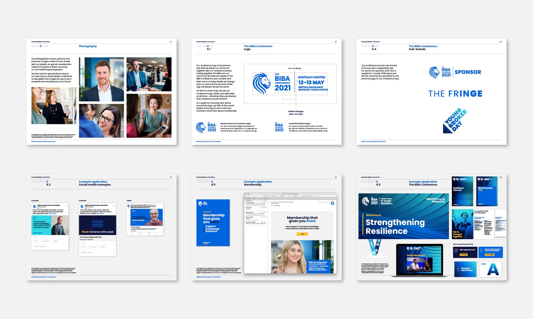
The architecture had to go beyond the core brand from launch as the marketing for BIBA’s (virtual) 2021 conference was launched alongside the new brand. A conference identity was created, affording the event its own look and feel – one that represented the year’s theme, but in a way that built upon the core of the brand rather than introduce foreign assets at such an early stage.
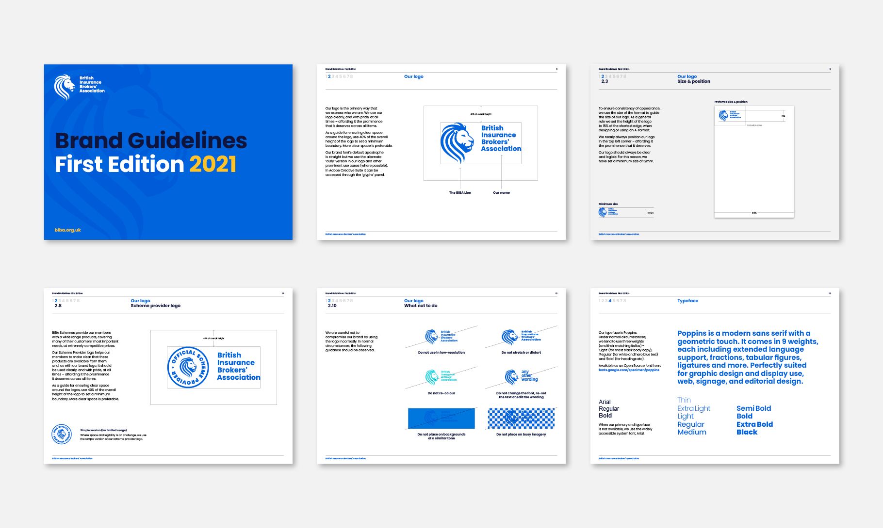
All parts of the brand are brought together in a robust, but really useable set of brand guidelines. They provide a framework for the brand’s consistent use – which will build brand reach and reputation – but they’re also packed with lots of brand examples that will help every part of the team, as well as those outside of BIBA who work with the brand, to be excited by the possibilities the brand holds and to get the most out of working with it.

